A method to create beautiful lightweight interactive maps in R using ggplot2 and SVG (Scalar Vector Graphics).
Author
Vincent Clemson
Published
October 29, 2023
Modified
October 31, 2023
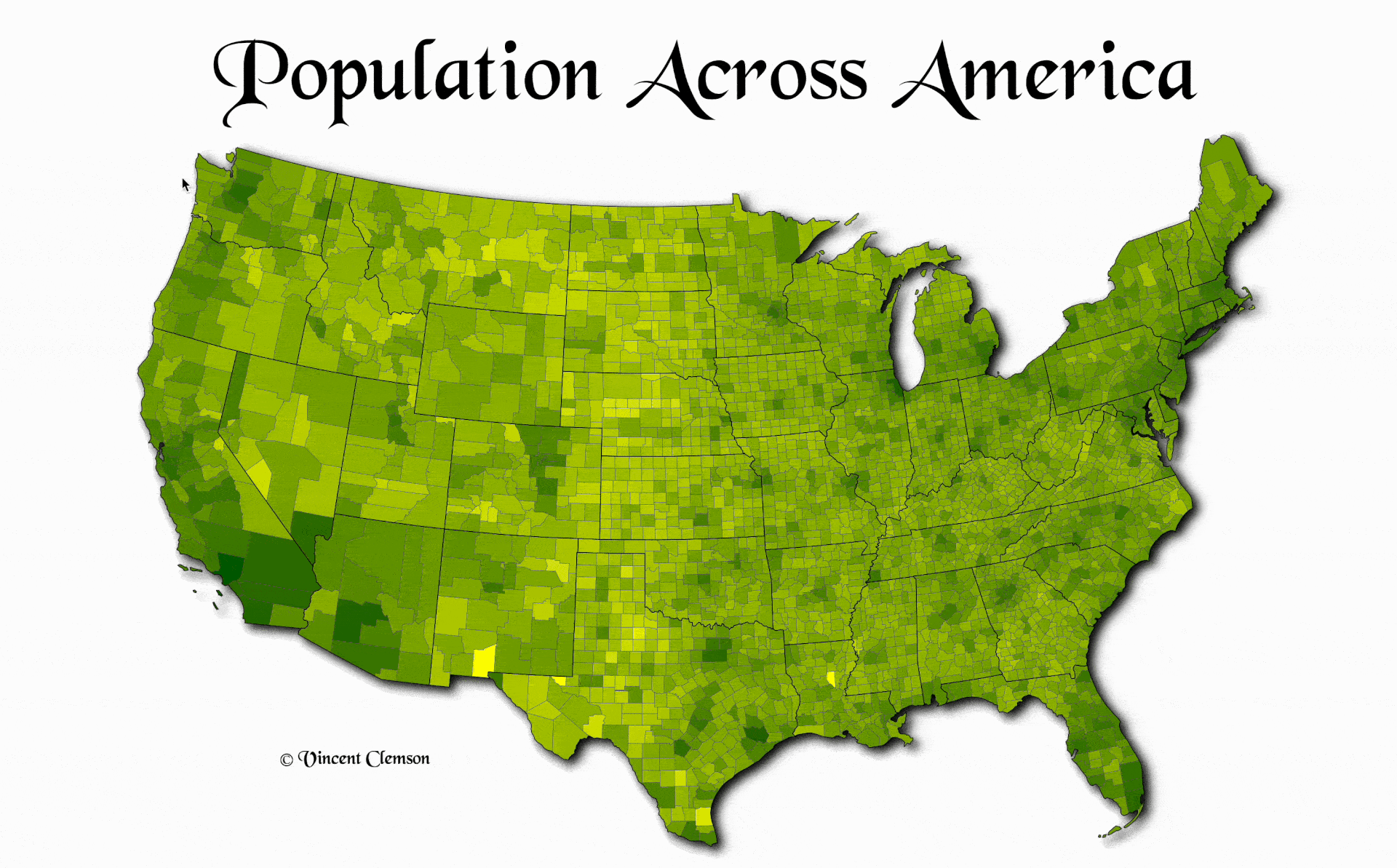
Figure 1: A choropleth map visualizing the population within each county of the continental United States in 2015.
The map was designed using ggplot2. Saving the map using svglite and editing the output has the potential to create beautiful interactive & lightweight maps.
TLDR
I show off how to use R packages in the #rspatial & tidyverse ecosystems to build both aesthetic & interactive maps. I also use some slightly advanced web dev & scraping techniques to create the finished product.
At the end of November, I plan on packing up my belongings and trekking 6,500 miles across the continental United States from Virginia out to the West coast (🗣️ roadtrip 🛣️).
Being who I am, I figured it’d be a great idea to plot out the journey using R. Additionally, the #30DayMapChallenge is approaching, so I figured that it was a great time to create a new thing in preparation for the challenge. Most of my time went into development over the past week, so the next steps for me are the trip planning, but I think the proof of concept is a great start!
Thoughts on Data Driven JavaScript Visuals
Plots & maps are cool, and interactive plots can be even cooler, but the bloat of adding external JavaScript libraries can sometimes create a performance hit to a user’s experience on the web. A typically approach within the R user community to embed data driven interactive graphics in web content involves using the incredible htmlwidgets package. There are several HTML widget R packages. These packages work by using htmlwidgets to bind & format data as JSON input to their respective JavaScript visualization libraries and then to output the results as an HTML element.
My biggest gripe with HTML widgets is that they embed the entire JavaScript library passed to them. So, if you say want 2 unique HTML widgets on your web page that are created from the same htmlwidgets ‘binding’ R package, then you’ll have 2 identical copies of the same JavaScript library downloaded to your web browser. Having the option to embed the library in say your web pages <head> element could help cut down on some of this bloat.
Aside from this, I think that being able to create data driven interactive graphics without the need for external JavaScript libraries has a lot of potential when it comes to creating beautiful plots in the browser. Building plots with SVG has been conquered by D3.js as well as many others that have taken significant influence from D3, such as plotly & highcharter. Additionally, Observable has changed the game when it comes to quickly prototyping & sharing new data visuals in the browser. Making it easier than ever before to collaborate & maximize one’s reach when developing a new dataviz powered by web technologies. In particular, its lead by Mike Bostock, one who I would call a super human with eons of data visualization expertise. At Observable, they’re building the Observable Plot library to help folks efficiently visualize tabluar data in the browser.
Plot is inspired by the grammar of graphics style, which is the foundation that ggplot2 was built upon. I think that the ability to turn a ggplot into a an interactive graphic can be extremely powerful and can open up many new doors into the world of dataviz. Using plotly and the incredible plotly::ggplotly designed by Carson Sievert is an htmlwidgets approach to doing this. The approach to use svglite to save ggplot2 created plots and then post process these graphics allows you to keep the design portion of the dataviz mostly outside of the web browser and within the Plot pane of your IDE (i.e. RStudio). The choice to post process the SVG output within R allows one to minimize JavaScript library dependencies, but presents the challenge of making the SVG interactive.
All in all, I’m excited to see where this goes.
The data
I used the 2015 U.S. Census county population data stored within the usmap package. More updated U.S. Census data from the U.S Census Bureau can be accessed via the tidycencus and censusapi R packages.
As a precursor, I filtered out Alaska & Hawaii because I am not planning to travel that far just yet, i.e. I want the focus of the plot to be on CONUS. I used the Albers equal area conic projection centered on the US. The proj4 string of the projection was highlighted in a neat post by Bob Rudis a few years back.
The key variable that I create here for the visual is the percentage of the population per state for each county. I ultimately display this using a log scale in the color palette of the plot to better visualize large differences in the county population. Additionally, this percentage gets used as hover text in the interactive figure.
usapop-data.R
library(sf)library(dplyr)library(usmap)# data load & format ----d <-left_join(usmap::us_map(regions='county'), usmap::countypop, by =c('fips', 'abbr', 'county')) |>as_tibble()# must create individual polygons first before entire counties of multiple polygonsd_sf <- d |>st_as_sf(coords =c('x', 'y'), crs = usmap::usmap_crs()) |>st_transform(4326) |>group_by(group) |>summarise(geometry =st_combine(geometry) |>st_cast('POLYGON'),across(c(abbr, pop_2015, full, county, fips), unique) ) |>group_by(fips) |>summarise(geometry =st_combine(geometry),across(c(abbr, pop_2015, full, county), unique),l_group =list(group) ) |>mutate(pop_full =sum(pop_2015, na.rm = T), .by = full) |>mutate(point =lapply(geometry, function(p) p |>st_cast('POINT') |>suppressWarnings()) |>st_sfc() |>st_set_crs(4326),county =sub(x = county, pattern =' County', replacement =''),pop_perc = pop_2015/pop_full ) |>mutate(text =paste0(sprintf(paste0(county, ', ', full, ' ', '%.2f%%'), 100*pop_perc),# for mapping SVG elements'|', lapply(geometry, length) |>unlist() ) )# ggplot ----## plot format objects ----proj <-'+proj=laea +lat_0=45 +lon_0=-100 +x_0=0 +y_0=0 +a=6370997 +b=6370997 +units=m +no_defs'd_sf_us <- d_sf |>filter(! full %in%c('Hawaii', 'Alaska')) |>summarise(geometry =st_combine(geometry)) |>mutate(geometry = geometry |>st_make_valid() |>st_union()) |>st_transform(proj)d_sf_states <- d_sf |>group_by(full) |>summarise(geometry =st_combine(geometry)) |>mutate(geometry = geometry |>st_make_valid() |>st_union(), .by = full) |>filter(! full %in%c('Hawaii', 'Alaska')) |>st_transform(proj)d_sf_plot <- d_sf |>filter(! full %in%c('Hawaii', 'Alaska')) |>st_transform(proj)
The ggplot
With the showtext package, I used a custom font that I downloaded from Fontsgeek, Black Chancery. Additionally, to give the plot a bit of a 3D effect, I added shadow using ggfx. It adds some good taste IMO.
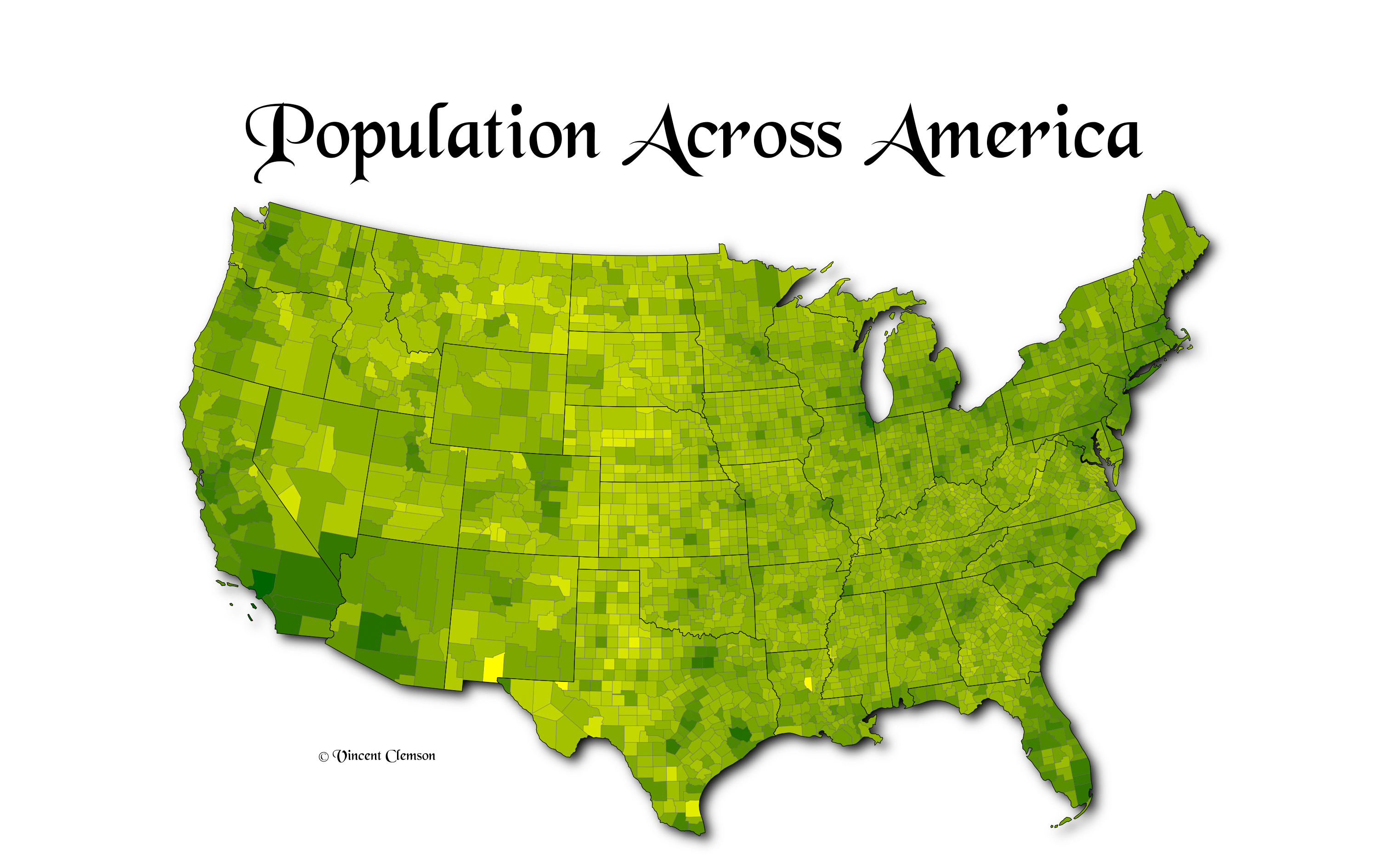
When it came to trying to save an identical copy of the rendered ggplot graphic within the RStudio Plot pane programmatically, I’ve found this to be very challenging. The ggplot::ggsave function has width, height, unit, & dpi parameters that can be specified. There’s also a great post by Christophe Nicault on setting the text DPI via the showtext package to match the DPI used within ggsave by the PNG graphics device. However on my 14” MBP, these methods all seem to fall short, with the ggsave approach font being larger than the font displayed in the Plot pane. It seems that the Plot pane does some magic when it comes to resizing. You can right click your image & choose “Save image as…”, which allows you to save what you’re looking at to file.
I think that there are benefits & drawbacks to both approaches. Below I provide the ggplot code version of the map. The last line of the snippet includes a ggsave call that builds a plot with text slightly bigger than what’s expected. Additionally, the ggfx shadow seems less prominent in the ggsave version, and the overall width / height of the plot content appear smaller as well.
Even if we switch the dpi to 72, and calculate the same width / height of the RStudio pane version to get the same resolution image in the ggsave version, i.e. both dpi & pixel width/height match amongst both files, we get even smaller text and other distortions.
Thus, I’ve included both versions in Figure 2 for comparison, the version that I saved from the RStudio plot pane, as well as the ggsave version. MacOS Preview app info on the .png tells me that the plot pane version ends up saving with 72 dpi (dots per inch), while the ggsave version has 254 as I’ve specified. Both files have near equivalent pixel size dimensions (3023 × 1889), with the key difference being the dpi.
Figure 2: Two ggplot versions of the county population map to compare save methods.
SVG & XML Editting
SVG (Scalar Vector Graphics) is itself its own markup language, based in XML and similar to HTML. The key difference between HTML & SVG being that HTML specifies how text is displayed to the browser, while SVG describes how graphics are displayed.
Because SVG files are written as XML, they can be loaded as objects and edited in scripting languages, similar to how commonly used web scraping tools work. Using the xml2 & rvest packages in combination from the tidyverse can help us run query selectors on the XML markup to add and remove XML element nodes as necessary.
Using the svglite package/graphics device within ggsave function calls, we can convert & save ggplots to SVG elements, and even use our custom fonts within them.
Note
showtext_auto(FALSE) should be ran within interactive R sessions that have set showtext_auto(enable = TRUE) before saving ggplots via ggsave to .svg.
Adding Iteractivity
Using vanilla JavaScript, I add a tooltip that reads the title attribute of each county boundary SVG <path> within the created choropleth group (<g>) element, e.g <g class="tooltip"><rect/><text></text></g>. The SVG tooltip element itself is a single <rect/> & <text> pair rapped in a group. When creating the SVG/XML document in R, I add it as the last graphic element in the <svg> container so that it displays on top of everything else. JavaScript handles updating the content of the <text> using event handlers on mouse movement. The tooltip was inspired by Lee Mason’s Basic SVG Tooltip Observable notebook. It differs in that it’s implemented as native SVG, rather than using a <div> wrapped in a <foreignObject>, which is incompatible in all browsers.
Code
svgChoro =document.querySelector('svg.svglite > g.choro')svgBords =document.querySelector('svg.svglite > g.borders')svgBordE =document.querySelector('svg.svglite > g.borders > path.end')tooltipG =document.querySelector('svg.svglite g.tooltip')tooltipR =document.querySelector('svg.svglite g.tooltip rect')tooltipT =document.querySelector('svg.svglite g.tooltip text')tooltipT.innerHTML='A'const pad =4const xR =0.5// for width of pathconst yR =0.5let tooltipTBox = tooltipT.getBBox()let hT = tooltipTBox.heightlet wT = tooltipTBox.widthlet hR = hT+pad*3+xRlet wR = wT+pad*2.5+yRlet xT = wR/2let yT = hR/2tooltipR.setAttribute('x', xR)tooltipR.setAttribute('y', yR)tooltipT.setAttribute('x', xT)tooltipT.setAttribute('y', yT)tooltipR.setAttribute('width',`${wR}px`)tooltipR.setAttribute('height',`${hR}px`)// right & bottom pixel offseftconst mouseOffset = [0,0]const svgBox =document.querySelector('svg.svglite').getBBox()// element to be replaced by hovered elementsvgBords.insertAdjacentHTML('beforeend','<path class="end"></path>')svgChoro.onmouseover=function(e) {if (e.target.nodeName=='path') {const bbox = e.target.getBBox() e.target.classList.add('hover','end') bordersGEnd =document.querySelector('svg.svglite > g.borders > path.end')// replacement of elementsconst dummy =document.createComment('') bordersGEnd.replaceWith(dummy) e.target.replaceWith(bordersGEnd) dummy.replaceWith(e.target)showTooltip(bbox.x, bbox.y, bbox.width, bbox.height, e.target.getAttribute('title'))// remove hover and put path elements back in original groups e.target.onmouseout=function(e) { e.target.classList.remove('hover','end') svgChoro.appendChild(e.target) svgBords.appendChild(bordersGEnd) } }}svgBords.onmouseleave= hideTooltip// Chrome compatibilitysvgChoro.onmouseleave= hideTooltipfunctionhideTooltip(e) { tooltipG.style.visibility='hidden'}functionshowTooltip(x, y, w, h, text) { tooltipT.innerHTML= text tooltipTBox = tooltipT.getBBox() hT = tooltipTBox.height wT = tooltipTBox.width hR = hT+pad*2 wR = wT+pad*2 xT = wR/2 yT = hR/2 tooltipT.setAttribute('x', xT) tooltipT.setAttribute('y', yT) tooltipR.setAttribute('width',`${wR}px`) tooltipR.setAttribute('height',`${hR}px`)const bottom_target = [x-w/2-mouseOffset[0], y+h+mouseOffset[1]]let xG = bottom_target[0]let yG = bottom_target[1]const tooltipRBox = tooltipR.getBBox()// uses max tooltip size to not going over right edgeif (xG > svgBox.width- tooltipRBox.width) { xG = x - (tooltipRBox.width<150? tooltipRBox.width:150) }// keeps from going over left edgeif (xG <0) { xG =0 }// keeps from going over bottomif (yG > svgBox.height- tooltipRBox.height) { yG = y - tooltipRBox.height- mouseOffset[1] }// tooltips will always be under top tooltipG.setAttribute('transform',`translate(${xG},${yG})`) tooltipG.style.visibility='visible'}
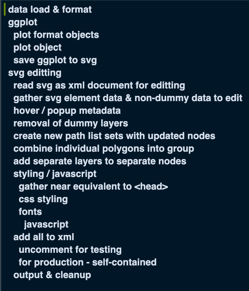
Combining all of these techniques involves quite a bit of prototyping. There’s a lot to pick apart, especially with mapping elements of the ggplot to the svg output correctly. Figure 3 displays an outline of the core components of the script. You can dive deep into the full script below. I originally built this to add within the about page/path of my site, so this is why paths are relative to the about/ directory.
When it comes to prototyping CSS/JavaScript, I created 2 methods to add styles and scripts. For testing purposes, I setup the CSS/JavaScript to source external scripts. This allows you to set breakpoints on script files sourced by the SVG in Developer Tools, as well as edit stylesheets natively in the Sources/Styling Editor. For ‘production’, I keep the graphic entirely self-contained, e.g. not sourcing any external scripts. This means that the SVG element can be downloaded and used in any browser context, without the need for the external .css/.js dependencies. Additionally, I embed the external .ttf font as base64 encoded data.
Figure 3: Outline within RStudio of the US population SVG graphic R script
Finished Product
Enjoy the viz!
Figure 4: The ggplot converted to SVG. A choropleth of the population of the continental United States in 2015.
Wrap-up
If you have any thoughts or questions, feel free to let me know what you think in the comments below. You’ll need to sign in to your GitHub account to do so. Like my work? Feel free to reach out.
We only have one rock, and it’s a beautiful one. Thanks for reading! ✌️🌍